Colour, Pablo Picasso once said, follows the changes of emotions. The great artist was reflecting the age-old knowledge that we all attach special feelings, meanings and symbolism to colours. Yet this is an insight too often overlooked by event organisers and venues.
While companies spend a great deal of effort ensuring their brand logos and trademarked insignia are faithfully reproduced in colour printing or on the web, when it comes to branding their events, the certainty is lost.
Colour psychologists argue that the human brain reacts instinctively to certain colours such as blue, since it is associated with the sky and the sea, or red and orange with their associations to the sun and fire.

Colour symbolism, on the other hand, explores the connections between colour and culture. These are associations that can differ radically depending on ethnic, religious or political backgrounds and even from generation to generation.
For example, depending on context and the eye of the beholder, green could signify Irishness to a Dubliner, Islam to an Indonesian, environmentalism to a young Singaporean or Taiwanese separatism to a Taipei voter.
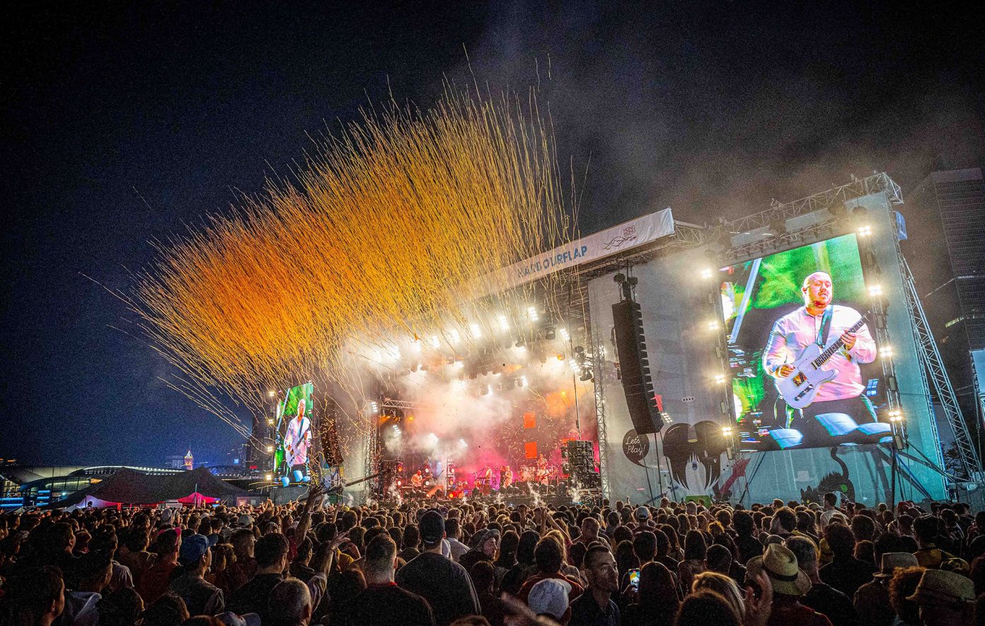
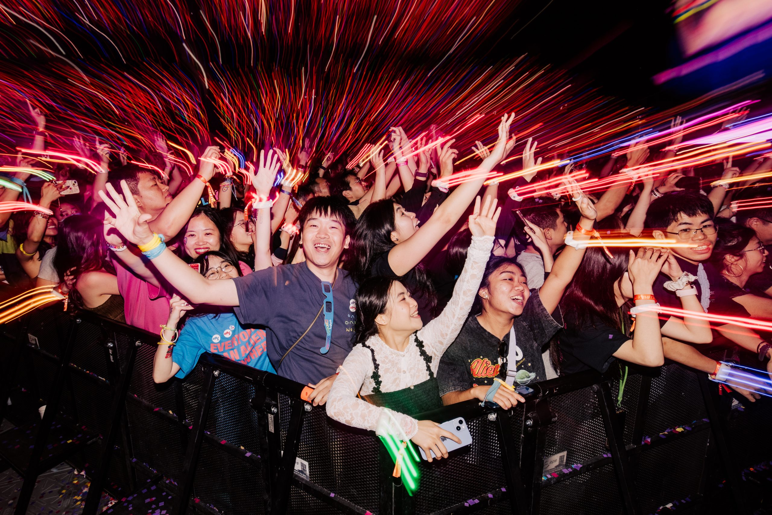
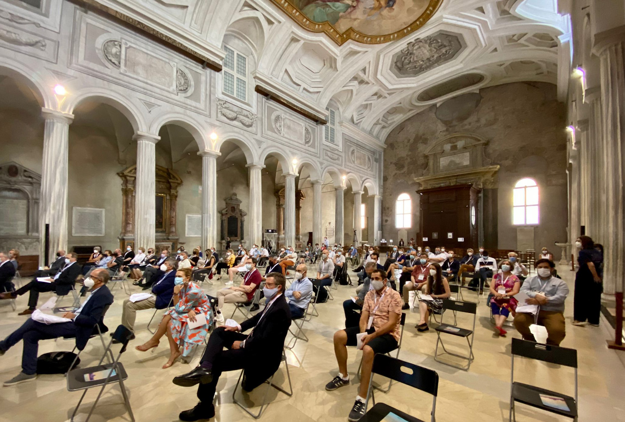
However, preventing controversial or potentially insulting misuse of colours is only one aspect of the issue. Event organisers and designers can take their knowledge of colour to increase the impact of your presentations, displays, stages and costumes. Venues can use colour to alter the mood and ambience of a meeting room, lighting can complement this, offering even limited spaces the ability to evoke different responses each time it is used. This applies not only to fixed fittings, such as curtains, carpets walls and ceilings but to mobile elements as well. Flowers and vases, and table and chair covers, are an obvious way of adding a splash of colour to a staid meeting room. Even small unobtrusive details, such as ice-blue water jugs and drinking glasses to give a room a refreshing feel, can have a subtle effect. These tips can clearly be applied to larger elements such as backdrops, signages and so on.
Red is a strong vibrant hue on the spectrum and as such often strikes the human eye in such a way that red items appear closer than those of other colours. Not surprisingly, that’s the reason why red is used frequently in traffic lights and stop signs to warn drivers. Red imagery stands out strongly and red backgrounds are eye-catching.
Even black and white, which are not strictly speaking colours, may seem to some unimaginative but they can be used to convey authority and seriousness.
Colour is such a key part of our everyday life that its impact is perhaps simply overlooked by busy organisers. However, used properly and with flair colour can lift your event or venue above the ordinary.
LIGHT
Colour is a phenomenon of light caused by how our eyes detect differing qualities of projected or reflected light. Because science and technology has allowed us to understand the physiology of the human eye, to measure wavelengths of light and chart energy patterns, we have come a long way in grasping the complexities of colour.
COLOUR CODES
Hilary Howes is senior national design manager of the US-based events company GES Exposition Services and a member of the Color Marketing Group (CMG), an association of commercial designers working with colour in different fields. Mix asked her for advice on how event organisers should handle colour.
Mix: Are there colours or colour combinations that should always be avoided?
HH: I love colour, so I think there may be a use for any colour.
However, in events there are some things to be concerned about. We are usually creating a background for human interaction and product display.
Colours are always perceived in contrast to their adjacent colours. You must be careful when using colours close to flesh tone so that people do not blend into the background. A common problem is a riot of so many colours that your ability to communicate with colour is lost in the noise of competing colours.
Another common mistake is to go too dark. In a dark environment the feeling can be oppressive, mysterious or dramatic, but if those aren’t your goals it is better to keep it light and bright.
Mix: Which are the safe or neutral colours that always seem to work in most situations?
HH: You will rarely go wrong by following the colour combinations of nature in your area. The tropical colours of Hawaii are great at events there but seem ludicrously out of place in London.
Black and white are the great neutrals that stand the test of time. Other neutrals follow trends over time and can look current or dated depending on how they are combined and who the audience are.
The current hot neutral is chocolate and I love it. But I have to admit it was last popular in the 1970s in the US so I have had to be careful with it for a while.
Mix: Which colours best set the mood? for example, if you were organising a vibrant brainstorming workshop, which are the colours that stimulate? if you were organising a relaxed event, which colours soothe?
HH: The moods colours create are nuanced by the cultural associations in each area. But speaking generally, we think of warm hues (reds, oranges, yellows) as stimulating and cool hues (greens, blues, purples) as soothing. Chroma or intensity (how pure a colour is) would be a factor too. More intense colours (higher chroma) are seen to stimulate while greys (low chroma) are
more soothing. Likewise value or tint/tone (adding white or black) would be seen to diminish the stimulating qualities of a particular colour.
For a brainstorming event it’s important to stimulate thinking and share information without conflict so a colour scheme that incorporated bright yellows with pastel blues and greens could be very effective. A soothing environment might have blues and/or greens combined with whites or very pastel yellows. It can be the same hues, in other words, but have very different effects based on other factors.
Mix: How can you use lighting best to reinforce colour?
HH: Besides objects having colour, all light has colour too. Daylight has all the colours of light (the full spectrum) so object colours are seen at their truest in daylight or artificial full-spectrum lights.
At events you can use coloured lights on white walls, curtains and so on to expand your colour statement from the coloured object you have brought in. Also you can tone down a coloured object by putting a complementary coloured light on it.
I have often used this effect on stage but it is important to realise that the light will colour people’s faces if it spills into an area of interaction.
Using a light the same hue as the object will intensify the effect, especially with reflective surfaces and fabrics.
Mix: Colours often have a symbolism that is quite specific to a society or culture. how should you handle these sensitivities?
HH: All aspects of design are culturally sensitive and it is important to have designers who are at least familiar with your audience, if not of your audience. There has been much discussion in the CMG about sharing more information about Asian colour preferences as more international companies do business there.
Mix: Could you say a little about the (CMG), particularly its work on events and hospitality sectors?
HH: The CMG serves as a way for individual industrial designers and colour experts to verify their sense of colour.
Events are very important as the place where new products are introduced and we send members to many throughout the year to report back on trends observed.
The hotel sector is very important as many trends for the home get their start when consumers are exposed to them while staying as guests.
Email: cmg@colourmarketing.org
HOTELS & COLOUR
Hotels and colour
From the guestroom to the meeting room, the poolside to the spa, colours can be used very deliberately to reinforce a hotel property’s positioning and to mark out business areas from relaxation points. The harder colours of an urban meeting space would be inappropriate in a spa resort seeking to attract incentives or corporate retreats. Mix asked some leading hotel brands how they use colour.
Starwood Hotels and Resorts operate a number of distinct brands and properties in the region.
Yeo Hwee-Peng, corporate communications manager of Starwood Asia Pacific Hotels and Resorts, says: “The Sheraton brand positioning is about creating an environment where guests feel they belong and are comfortable, so we use a lot of warm colours like orange and purple in our interiors as well as collateral items.
“For Westin, it is all about personal renewal, so the colours used tend to be more spa-like, with more muted colours such as beige, white, cream, pastel green and so on.”
Banyan Tree Hotels and Resorts and sister brand Angsana Resorts and Spas cater to the very high-end smaller meeting and incentive group. Their typical group is looking to get away from the corporate routine and environment.
Angsana communications executive Lu Liqing says: “Angsana Resorts and Spas are designed as contemporary, chic and vibrant retreats targeted at the younger customer segment. Bright colours such as tangerine and cool lime green are used to give the interior a refreshing feel to tailor to the market. The interior decoration is an invigorating mix of tropical and contemporary styles with a touch of Asian artwork. This allows the brand to create a distinctive image and feel which guests at Angsana can identify with once they step into any of the resorts. The vibrant colours are reflected throughout the resort, from the walls to the display shelf to even the smallest details such as the pillows in the spa pavilion.”
Angelina Hue, public relations and marketing executive at Banyan Tree, illustrates the brand philosophy by referring to the Banyan Tree Ringha resort in China. She says: “The colour scheme and cultural accents are evident throughout the design of the resort – from the deep red tones of the walls, authentic Tibetan farmhouses converted into lodges, to handcrafted wooden bath tubs in the suites and lodges.”


